
The media in this post is not displayed to visitors. To view it, please go to the original post.
@kde Konqi is pleased with their new Mecha comet!  " title="
![]() "/>
"/>  ☄️
☄️
This entry was edited (4 months ago)
qkall likes this.
reshared this

like this
reshared this
like this
like this
reshared this
 - Link to source")
Auf YouTube findest du die angesagtesten Videos und Tracks. Außerdem kannst du eigene Inhalte hochladen und mit Freunden oder gleich der ganzen Welt teilen.Stones Throw (YouTube)
i took a history of chemistry course and half of it was chemistry... i'm for this content.

Alchemy is so hot right now.
Arecibo, Puerto Rico
qkall likes this.
reshared this
like this
reshared this
It upsets me there's no sound. Thanks my year is ruined already.
Edit: It's just Voyager being dumb and not giving me the audio. My year has been saved.
snap sucks
why is the backend closed source
what is canonical hiding from us
ubuntu sucks
I agree, however I use snap because my partner's use it. Plus the stupid streaks keep me from falling back into a major depression where I just turtle and don't talk to anyone for 6 months but my wife.
I think things being closed source in the case of these chat/social media apps is the fact if we get the source we can probably figure out ways to bypass the paywalls.
What's the beef with Ubuntu? I use bazzite and debian myself?
youtube.com/shorts/mbEMAVC8GaI
Auf YouTube findest du die angesagtesten Videos und Tracks. Außerdem kannst du eigene Inhalte hochladen und mit Freunden oder gleich der ganzen Welt teilen.www.youtube.com
qkall likes this.
reshared this
H
A
P
P
Y
N
E
W
Y
E
A
R
。 ・
。°*.
。*・
like this
reshared this

Auf YouTube findest du die angesagtesten Videos und Tracks. Außerdem kannst du eigene Inhalte hochladen und mit Freunden oder gleich der ganzen Welt teilen.Сергей Чуплыгин (YouTube)
qkall likes this.
reshared this
Just pick one - All the Fox functionality without bloatware
Librewolf - librewolf.net/
Waterfox - waterfox.com/
Zen Browser - zen-browser.app/
More browsers here - alternativeto.net/category/bro…
Also you can use this add to disable the ~~shitload~~ ai function in many search engines in one go
addons.mozilla.org/en-US/firef…
GitHub page - github.com/jruns/disable-ai
You can find all the links on Mastodon<
Download Disable AI for Firefox. Don't just hide results. Disable AI overviews on Brave Search, DuckDuckGo, Ecosia, Google, and Qwant so your searches consume less energy and water.addons.mozilla.org
like this
qkall reshared this.

Weekly GNU-like #MobileLinux Update (52/2025): #postmarketOS v25.12 and Other Last Minute Goodies!
linmob.net/weekly-update-52-20…
#Phosh #Sxmo #SailfishOS #UbuntuTouch #Fedora #Pocketblue #FuriLabsFLX1s #MNTReformTouch #LinuxMobile #LinuxonMobile
LINMOB.net is a blog about LINux on MOBile devices. With the PinePhone (Pro) and Librem 5 shipping it is back to report on GNU+Linux on mobile devices.LINux on MOBile
like this
reshared this
Un-redacted text from released documents began circulating on social media on Monday eveningGeorge Chidi (the Guardian)
like this
reshared this
Young earth creationists like to point out select examples where fossils have been dated incorrectly. They can't see that the ability of science to self-correct is its strength.
Dogma is static (or very slow to change), and is ultimately grounded in unfalsifiable assertions. Science rewards those who overturn past claims with new data.
Science also discovers new methods of confirming findings like the age of fossils. sciencedaily.com/releases/2025…
Researchers have found that fossilized dinosaur eggshells contain a natural clock that can reveal when dinosaurs lived. The technique delivers surprisingly precise ages and could revolutionize how fossil sites around the world are dated.ScienceDaily
@SteveClough And to be totally transparent, I'm not a scientist — just in case someone wants to quibble about my characterization of how new research can overthrow incorrect ideas.
As you point out, new discoveries can also expand upon established theories, as opposed to jettisoning them altogether.
I'm mainly interested in the topic from the perspective of a former fundamentalist who has come to understand how I was mislead. I'm now learning more all the time.
I am only a computer scientist! And come from an evangelical background that has changed utterly - so I view from a similar position.
But I do think that science and faith are a whole lot closer than most people seem to think. There is belief at the heart of science. And conversely, faith is not "God of the gaps" - it has to have something extra, something different.
This must not be allowed to continue! I just do not have the words for this.
Find your local Flock camera installations:
deflock.me/
Auf YouTube findest du die angesagtesten Videos und Tracks. Außerdem kannst du eigene Inhalte hochladen und mit Freunden oder gleich der ganzen Welt teilen.Benn Jordan (YouTube)
like this
reshared this
Weekly GNU-like #MobileLinux Update (51/2025): The Other Half reloaded
linmob.net/weekly-update-51-20…
#LinuxMobile #postmarketOS #Jolla #SailfishOS #VoidPhone #FuriLabsFLX1 #UbuntuTouch #Mobian #Droidian #RhinoLinux #NemoMobile
LINMOB.net is a blog about LINux on MOBile devices. With the PinePhone (Pro) and Librem 5 shipping it is back to report on GNU+Linux on mobile devices.LINux on MOBile
qkall likes this.
reshared this
like this
reshared this

Rhino Linux 2025.4 Brings Lomiri Packages and Updated Kernels
Over five months after its previous 2025.3 version, the Rhino Linux team has unveiled its latest release, 2025.4, on its Ubuntu-based rolling-release distribution, which features a custom desktop environment (Unicorn) built around the Pacstall package manager.According to the announcement, over the past months, much of the team’s effort has gone into advancing Lomiri upstream, a mobile-first desktop environment created for Ubuntu Touch, and integrating it more deeply into Rhino Linux, particularly for PINE64 hardware.
As part of this work, the distribution now ships two new packages: rhino-pine-lomiri-core and ubxi-lomiri-desktop. The latter is not limited to PINE64 devices and is also compatible with Rhino Linux generic images.
Rhino Linux 2025.4 Brings Lomiri Packages and Updated Kernels
Rhino Linux 2025.4 introduces new Lomiri packages, improved PINE64 support, and multiple kernel updates across supported devices.Bobby Borisov (Linuxiac)

The testing phase for v25.12 has officially begun! If you want to give the new postmarketOS release a try early and help with finding bugs on *your* device, find the instructions here:
gitlab.postmarketos.org/postma…
Happy testing! 🧪
Dear testing team and device maintainers, and everybody else who is interested in testing: the v25.12 testing phase has begun! 🚀GitLab
like this
reshared this
like this
reshared this
like this
reshared this
youtube.com/watch?v=uB0gr7Fh6l…
I hate this timeline...
#privacy #security #thismatters #uspol
Auf YouTube findest du die angesagtesten Videos und Tracks. Außerdem kannst du eigene Inhalte hochladen und mit Freunden oder gleich der ganzen Welt teilen.Benn Jordan (YouTube)
Christmas reminder: If GOP didn’t give 800 billionaires a $2T tax cut (again)—we’d have enough for SNAP, cancel all medical debt, and cancel all student debt.
GOP sold out 200M Americans to serve 800 billionaires.
This is what class war on working people looks like. Stop bootlicking billionaires. Start taxing them out of existence.
qkall likes this.
reshared this
Undersold.
Canceling all medical and student debt would have been a massive boon on the economy, which would leave us with even more money.
You can't tax billionaires out of existence unless you can form a global government that enforces a uniform tax scheme.
Barring that, all you're doing is incentivizing the wealthy to move to a more favorable tax jurisdiction.
So, I finally got my #oneplus6 out from the shop.... That was the worst experience ever and they're a long-time spot I go to... That's a whole other story. #enshifification Anyway, the one plus (#ihavejokes) is that the battery replacement went great. I've expressed some reservation switching from my #pixel3a to the op6... But man. I'm happy. Nothing Fancy...
Apps
#btop
wf-recorder
#firefox (minima css, tridactyl)
#halloy
#nheko
#kdenlive
Tags
#qobuz
#postmarketOS
#sxmop6 #sxmo
#video
@Linux Phones
@Linux Phones
@LINux on MOBile
@Linux
@@linux on Linux.Community
Music - Bomb The Music Industry - 'Syke! Life Is AWESOME!'
quoteunquoterecords.com/qur004…
~video~
files.catbox.moe/0by4bk.mp4
reshared this
#TBT to 2021 when this guy entered our lives.
You’re a very handsome #rabbit, Valmont Jones.
qkall likes this.
reshared this

Source: oslo.town/@luftvaffel/11532770…
like this
reshared this
like this
reshared this
Here's the article from the university but you gotta translate it
石垣島沖のわずかな光のみが届く「トワイライトゾーン」と呼ばれる海域から、平坂 寛氏が新種のハゼ科魚類を釣りにkohokoho (琉球大学)
The postmarketOS v25.12 release is coming closer, which means that once again we need your help with selecting a wallpaper! 
Poll is in the comments.
All of them were made by the talented @dikasetyaprayogi, thank you so much!
qkall likes this.
reshared this
The long wait is over, Ganymede has arrived
Yes, we know it has been a long time since we released an ISO refresh. So, before I start the announcement, I want to get rid of a concern or rumour: our project is still active, and we're not going anywhere.
We still love what we do over here, but we all have chosen to let our lives and loved ones come first over the project. That certainly doesn't mean w
endeavouros.com/news/the-long-…
#News
Yes, we know it has been a long time since we released an ISO refresh. So, before I start the...Bryanpwo (EndeavourOS)
like this
reshared this
like this
reshared this
Fundraiser news: Adopt a KDE dragon!
10 KDE dragons turned up on our doorstep today looking for families to adopt them. Contribute €100 or more to our fundraiser and one of these amigurumi cuties will go and live with you!
kde.org/fundraisers/yearend202…
All Konqis are hand-reared with care and love by a kind lady from Barcelona and are all different and unique.
#fundraiser #dragons #FreeSoftware #OpenSource
Help us bring KDE’s software catalogue into the mainstream! Plasma 6 is a stable, usable and accessible desktop environment that brings us closer to meeting the needs of private citizens, companies and public institutionsReaching the Inflection Point
qkall likes this.
reshared this
All dragons and kaijus have now been adopted!
kde.org/fundraisers/yearend202…
A big thank you to everybody for your generosity ❤️ !
Help us bring KDE’s software catalogue into the mainstream! Plasma 6 is a stable, usable and accessible desktop environment that brings us closer to meeting the needs of private citizens, companies and public institutionsReaching the Inflection Point
reshared this
qkall likes this.
reshared this
like this
reshared this
I really need more sales to cover my rent and bills this November/Native American Heritage Month! Buy some beadwork for yourself and for gifting-- every sale helps ❤❤
Boosts also appreciated 💕
Online store → cvkvlv.com
Goal for November: $2030/$4000
Mvto!! (Thank you!)
#MutualAid #IndigenousMutualAid #Indigenous #Artist #FediGiftShop #ArtForSale
reshared this
I realize I just posted this on another instance... but that one is going away soon... so for posterity.
Some people are interested in this... and, genuinely, thank you for asking. I try to post my (very few niche ass and no one cares) videos with artists I wish more folks paid attention to and it seems that's a good thing and I get into a lot of conversations about it. But, anyway, here's this years list. I tried adding two songs per month as a 'this is me now' this month type of thing. I did try to keep 'early album and late album' songs in their place... but, whatever. Enjoy? What did you like or hate the most?
I did leave the more 'epic' songs towards the end... mostly because they're long and I do not expect humans to listen to it all. So, if you made it that far... I got that dank for you.
open.qobuz.com/playlist/343774…
youtube.com/watch?v=nZwTBSrnkG…
#music #topof2025 #isthisearly #hifi #qobuz #leavespotify #qobuz
I've disabled auto-posting of Liliputing articles to this account, after receiving a warning from @fosstodon that it looks like I'm spamming.
The WordPress ActivityPub plugin is still kind of buggy, but you can try following these accounts:
@liliputing_ - This shows all I've written, but not those from other authors.
@liliputing - This should display posts from all authors. It can be hit or miss though.
You can also follow Liliputing on BlueSky: @liliputing.bsky.social.
like this
reshared this
I just called my reps with 5 Calls, you should* too. They make it super easy to contact the appropriate office(s) about specific issues, and give you a script for the call.
Boost if you think this might be useful for your peeps.
* You should if you're American. And if you give a shit about other people.
qkall likes this.
reshared this
And now for something COMPLETELY different:
Linux booting *inside* a PDF file. (Uses embedded JS to run a RISCV emulator and boot Linux to a command line prompt):
github.com/ading2210/linuxpdf?…
theregister.com/2025/02/16/dev…
What's next, Crysis-in-a-CSV?Brandon Vigliarolo (The Register)
qkall likes this.
reshared this

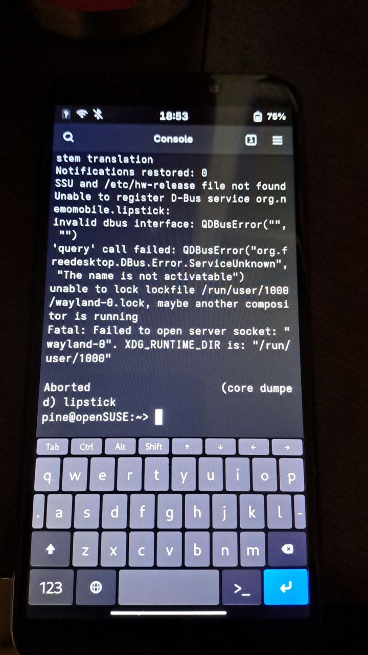


Koutsie
in reply to Bhushan Shah 🤖🥸🦹 • • •elly
in reply to Bhushan Shah 🤖🥸🦹 • • •Bhushan Shah 🤖🥸🦹
in reply to elly • • •